SVG Half Arc in React Native

Last updated: May 2025
 View on GitHub
SVG Half Arc
This is an SVG React Native half arc implementation written in TypeScript. Here is what we're building:
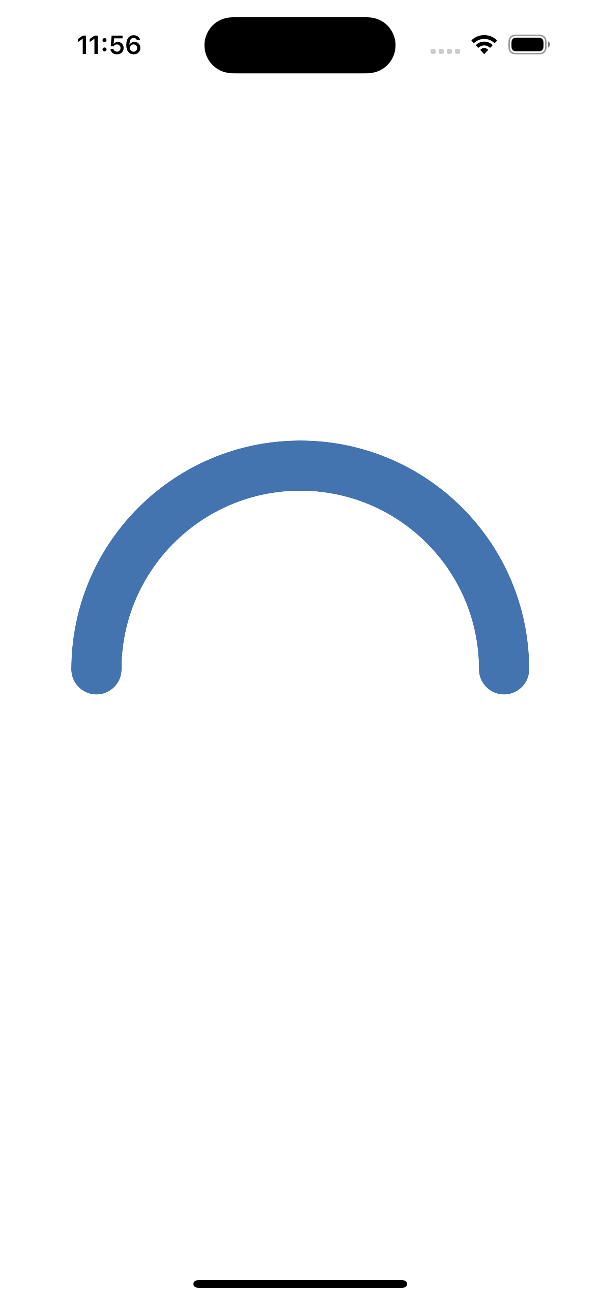
Half Arc Preview
-
Install the React Native SVG package
npm install react-native-svg -
Navigate to the
\iosfolder and install pods
cd ios
pod install
- Create Arc Component
Create a file for your arc components and add your imports, mine is called HalfArc.tsx. If you don't want to use TypeScript just ignore anything related to types.
// HalfArc.tsx

import React from 'react';
import {View} from 'react-native';
import Svg, {Path} from 'react-native-svg';

const HalfArc: React.FC<Element> = () => {
    // ...
}
Define Variables
Now let's define some variables:
sizewidth and height of the SVG (sizeXsizesquare)strokeWidththickness of the arc's lineradiusarc's radius adjusted for the stroke's widthcenterXcenter of the svgcenterYthe SVG is a square, so same as above
const HalfArc: React.FC<Element> = () => {
    const size = 300;
    const strokeWidth = 33;
    const radius = (size - strokeWidth) / 2;
    const centerX = size / 2;
    const centerY = size / 2;

    // ...
}
Arc Angle Calculations
Now we'll calculate the starting point of the start angle (where the left point of the arc begins). This will be different depending on where you want your arc to be oriented:
const startRad = (270 - 90) * (Math.PI / 180);
I want my arc to start at the "left" of the SVG so I will use const startRad = (270 - 90) * (Math.PI / 180);, but you can change 270 to adjust the starting point of your arc.
Here are some examples:

const startRad = (0 - 90) * (Math.PI / 180)

const startRad = (90 - 90) * (Math.PI / 180)

const startRad = (180 - 90) * (Math.PI / 180)

const startRad = (270 - 90) * (Math.PI / 180)
Now we will create endRad which calculates the end point of our arc (opposite of startRad):
const endRad = startRad + Math.PI;
Math.PI (π) is equal to 180° so by adding π to startRad we are offsetting startRad by half a circle which will create our half circle.
Let's create variables for our Cartesian x and y start points:
const startX = centerX + radius * Math.cos(startRad);
const startY = centerY + radius * Math.sin(startRad);
Our coordinates (startRad and endRad in this example) are polar coordinates meaning points are represented by a radius and an angle. SVG requires Cartesian coordinates, where points are represented on a grid using an x and y value, so we must convert our polar coordinates to Cartesian coordinates: x = centerX + r * cos(θ) and y = centerY + r * sin(θ)
Now we will do the same for the endpoint coordinates:
const endX = centerX + radius * Math.cos(endRad);
const endY = centerY + radius * Math.sin(endRad);
SVG Arc Flags
We will create two variables to keep track of the SVG arc flags:
const largeArcFlag = 0;
This flag is for arc >180°, since we are creating a half arc (=180°) we will disable this flag.
const sweepFlag = 1;
This flag indicated the sweep direction of the arc: 1 = clockwise, 0 = counterclockwise.
Path Data Command
Now that we have all of our variables, we will combine them all into a string to define the shape of our SVG arc.
const pathData = [
    `M ${startX} ${startY}`,
    `A ${radius} ${radius} 0 ${largeArcFlag} ${sweepFlag} ${endX} ${endY}`,
].join(' ');
Min the first string means "move to". Basically it just represents the starting point of our arc.Adraws an arc from the current point (set byM) and ends at${endX} ${endY}, using the radius, rotation (0), and flag parameters to control its shape and direction.
Now we can put all of this together to create our arc!
return(
    <View style={[{width: size, height: size}]}>
        <Svg width={size} height={size} style={{backgroundColor: 'transparent'}}>
            <Path
                d={pathData}
                stroke={'#4374B0'}
                strokeWidth={strokeWidth}
                fill={'none'}
                strokeLinecap="round"
            />
        </Svg>
    </View>
);
Complete File
import React from 'react';
import {View} from 'react-native';
import Svg, {Path} from 'react-native-svg';

const HalfArc: React.FC<Element> = () => {
  const size = 300;
  const strokeWidth = 33;
  const radius = (size - strokeWidth) / 2;
  const centerX = size / 2;
  const centerY = size / 2;

  const startRad = (270 - 90) * (Math.PI / 180);
  const endRad = startRad + Math.PI;

  const startX = centerX + radius * Math.cos(startRad);
  const startY = centerY + radius * Math.sin(startRad);
  const endX = centerX + radius * Math.cos(endRad);
  const endY = centerY + radius * Math.sin(endRad);

  const largeArcFlag = 0;

  const sweepFlag = 1;

  const pathData = [
    M ${startX} ${startY},
    A ${radius} ${radius} 0 ${largeArcFlag} ${sweepFlag} ${endX} ${endY},
  ].join(' ');


  return (
    <View style={[{width: size, height: size}]}>
      <Svg width={size} height={size} style={{backgroundColor: 'transparent'}}>
        <Path
          d={pathData}
          stroke={'#4374B0'}
          strokeWidth={strokeWidth}
          fill={'none'}
          strokeLinecap="round"
        />
      </Svg>
    </View>
  );
};

export default HalfArc;
Usage
<HalfArc/>
Add Progress Indicator
To add a progress indicator:
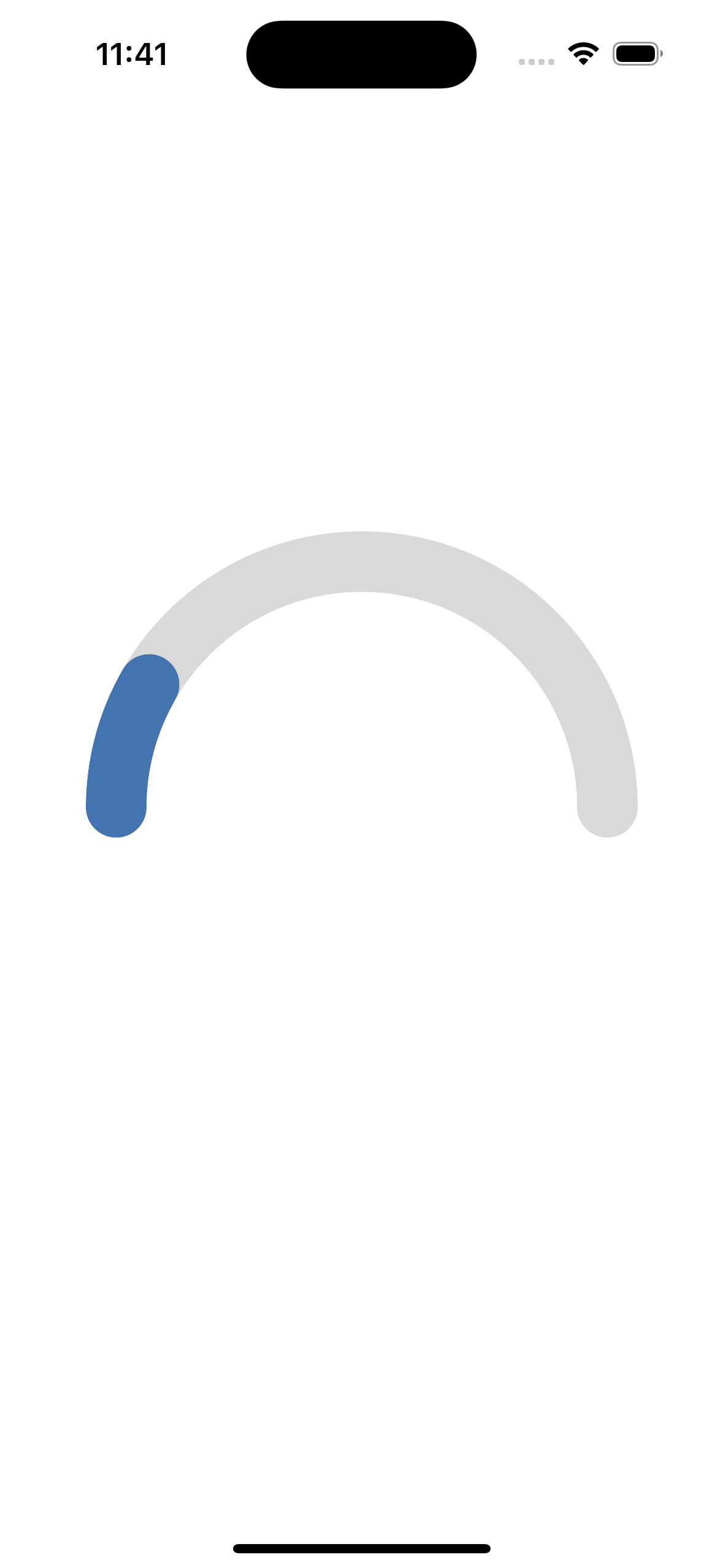
Half Arc Preview
Prop Type
I want HalfArc to take a progress variable and a total value variable so the first thing that I am going to do is define a type for my component's props.
type HalfArcProps = {
  progress: number;
  totalValue: number;
};
I will also modify HalfArc to accept these props:
const HalfArc: React.FC<HalfArcProps> = ({progress, totalValue}) => {
Defining Additional Variables
Basically the progress indicator is just a second arc. I need to figure out how far along the progress bar is relative to the underlying arc, which is represented by progressRad. Once I have that value, I can add it to startRad to get the end point of the progress arc, progressEndRad:
const progressRad = Math.PI * (Math.max(0, Math.min(totalValue, progress)) / totalValue);
const progressEndRad = startRad + progressRad;
Math.max(0, Math.min(totalValue, progress)) ensures that the progress arc is within the scope of the underlying arc.
We will also need to define additional start and end Cartesian coordinates for the progress arc using progressEndRad:
const progressEndX = centerX + radius * Math.cos(progressEndRad);
const progressEndY = centerY + radius * Math.sin(progressEndRad);
We do not need to create progressStartX or progressStartY because we will reuse ``startXandstartY` since both arcs will start at the same point.
Progress Arc Path Data
We will need to split the path data into two, for each arc:
const underlyingPathData = [
  `M ${startX} ${startY}`,
  `A ${radius} ${radius} 0 ${largeArcFlag} ${sweepFlag} ${fullEndX} ${fullEndY}`,
].join(' ');

const progressPathData = [
        `M ${startX} ${startY}`,
        `A ${radius} ${radius} 0 ${largeArcFlag} ${sweepFlag} ${progressEndX} ${progressEndY}`,
      ].join(' ');
Progress Arc Path Component
Just like above, we will need two path components, one for each arc:
<Path
  d={backgroundPathData}
  stroke={'#D9D9D9'}
  strokeWidth={strokeWidth}
  fill={'none'}
  strokeLinecap="round"
/>
{progress > 0 && (
  <Path
    d={progressPathData}
    stroke={'#4374B0'}
    strokeWidth={strokeWidth}
    fill={'none'}
    strokeLinecap="round"
  />
)}
progress > 0 checks if there is even a progress value large enough to even render a progress arc.
stroke should be different values for each arc so that the progress arc is visible.
Complete File
import React from 'react';
import {View} from 'react-native';
import Svg, {Path} from 'react-native-svg';

type HalfArcProps = {
  progress: number;
  totalWearableDays: number;
};

const HalfArc: React.FC<HalfArcProps> = ({progress, totalWearableDays}) => {
  const size = 300;
  const strokeWidth = 33;
  const radius = (size - strokeWidth) / 2;
  const centerX = size / 2;
  const centerY = size / 2;

  const startRad = (270 - 90) * (Math.PI / 180);
  const fullEndRad = startRad + Math.PI;

  const progressRad =
    Math.PI * (Math.max(0, Math.min(100, progress)) / totalWearableDays);

  const progressEndRad = startRad + progressRad;

  const startX = centerX + radius * Math.cos(startRad);
  const startY = centerY + radius * Math.sin(startRad);
  const fullEndX = centerX + radius * Math.cos(fullEndRad);
  const fullEndY = centerY + radius * Math.sin(fullEndRad);

  const progressEndX = centerX + radius * Math.cos(progressEndRad);
  const progressEndY = centerY + radius * Math.sin(progressEndRad);

  const largeArcFlag = 0;

  const sweepFlag = 1;

  const backgroundPathData = [
    `M ${startX} ${startY}`,
    `A ${radius} ${radius} 0 ${largeArcFlag} ${sweepFlag} ${fullEndX} ${fullEndY}`,
  ].join(' ');

  const progressPathData = [
          `M ${startX} ${startY}`,
          `A ${radius} ${radius} 0 ${largeArcFlag} ${sweepFlag} ${progressEndX} ${progressEndY}`,
        ].join(' ');

  return (
    <View style={[{width: size, height: size}]}>
      <Svg width={size} height={size} style={{backgroundColor: 'transparent'}}>
        <Path
          d={backgroundPathData}
          stroke={'#D9D9D9'}
          strokeWidth={strokeWidth}
          fill={'none'}
          strokeLinecap="round"
        />
        {progress > 0 && (
          <Path
            d={progressPathData}
            stroke={'#4374B0'}
            strokeWidth={strokeWidth}
            fill={'none'}
            strokeLinecap="round"
          />
        )}
      </Svg>
    </View>
  );
};

export default HalfArc;
Usage
<HalfArc progress={daysWorn} totalWearableDays={totalWearableDayCount} />
Congratulations 🥳 You've successfully created an SVG half arc in React Native!
Check out our other React Native Component docs for more!