Segmented Toggle in React Native

Last updated: June 2025
 View on GitHub
In this tutorial, we’ll walk through creating a simple and customizable segmented toggle component. This component is perfect for forms, filters, tabbed views, and more!
Here's what we're making:
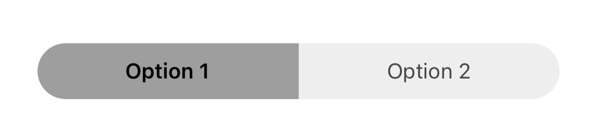
TLDR: Click here to scroll to the completed component file
- Import React Native Components
At the top of your component file (mine is SegmentToggle.tsx), you will import the following:
import React, {useState} from 'react';
import {View, Text, TouchableOpacity, StyleSheet} from 'react-native';
- Define State Variables
This is where you'll define the selected state variable, with values/labels associated with each side of the toggle.
const [selected, setSelected] = useState<'option 1' | 'option 2'>('option 1');
Selected can only be equal to option 1 or option 2. One side of the toggle will always be selected.
- Component and Styles
Now we are ready to start building out our segmented toggle. We'll start with the left side of the toggle.
First we are going to add a View and add styles.container
<View style={styles.container}>
// ...
</View>
styles.container:
const styles = StyleSheet.create({
  container: {
    flexDirection: 'row',
  },
})
Explanation
flexDirection: 'row',: aligns both sides of the toggle next to each other (instead of stacking them vertically)
Next, we will create the left side (segment) of the toggle:
- We will add a
TouchableOpacityto handle the left side of the toggle being selected:
//...
<TouchableOpacity
        style={[
          styles.segment,
          selected === 'option 1'
            ? styles.selectedSegment
            : styles.unselectedSegment,
          styles.leftSegment,
        ]}
        onPress={() => setSelected('option 1')}>
        // ...
</TouchableOpacity>
selected === 'option 1' ? styles.selectedSegment : styles.unselectedSegment: sets the style based on whether or not this side is selected using theselectedstate variablestyles.leftSegment: gives left side specific stylingonPress={() => setSelected('option 1')}: sets theselectedvariable tooption 1and deselectsoption 2when the left side of the toggle is pressed
styles.segment
Each side of the toggle has three styles applied: one for layout (segment), one for selection state (selectedSegment / unselectedSegment), and one for shape (leftSegment / rightSegment).”
segment: {
  paddingVertical: 10,
  paddingHorizontal: 25,
  flex: 1,
  alignItems: 'center',
},
selectedSegment: {
  backgroundColor: '#9E9E9E',
},
unselectedSegment: {
  backgroundColor: '#EEEEEE',
},
leftSegment: {
  borderTopLeftRadius: 40,
  borderBottomLeftRadius: 40,
},
segment: gives the segment some horizontal and vertical spacing, allows it to use up all of the available space designated for it (flex: 1), and centers it within the segmentselectedSegment: background color for the selected segment sideunselectedSegment: background color for the unselected segment sideleftSegment: rounds the top left and bottom left corners while keeping the top right and bottom right the same
At this point the toggle looks like this:
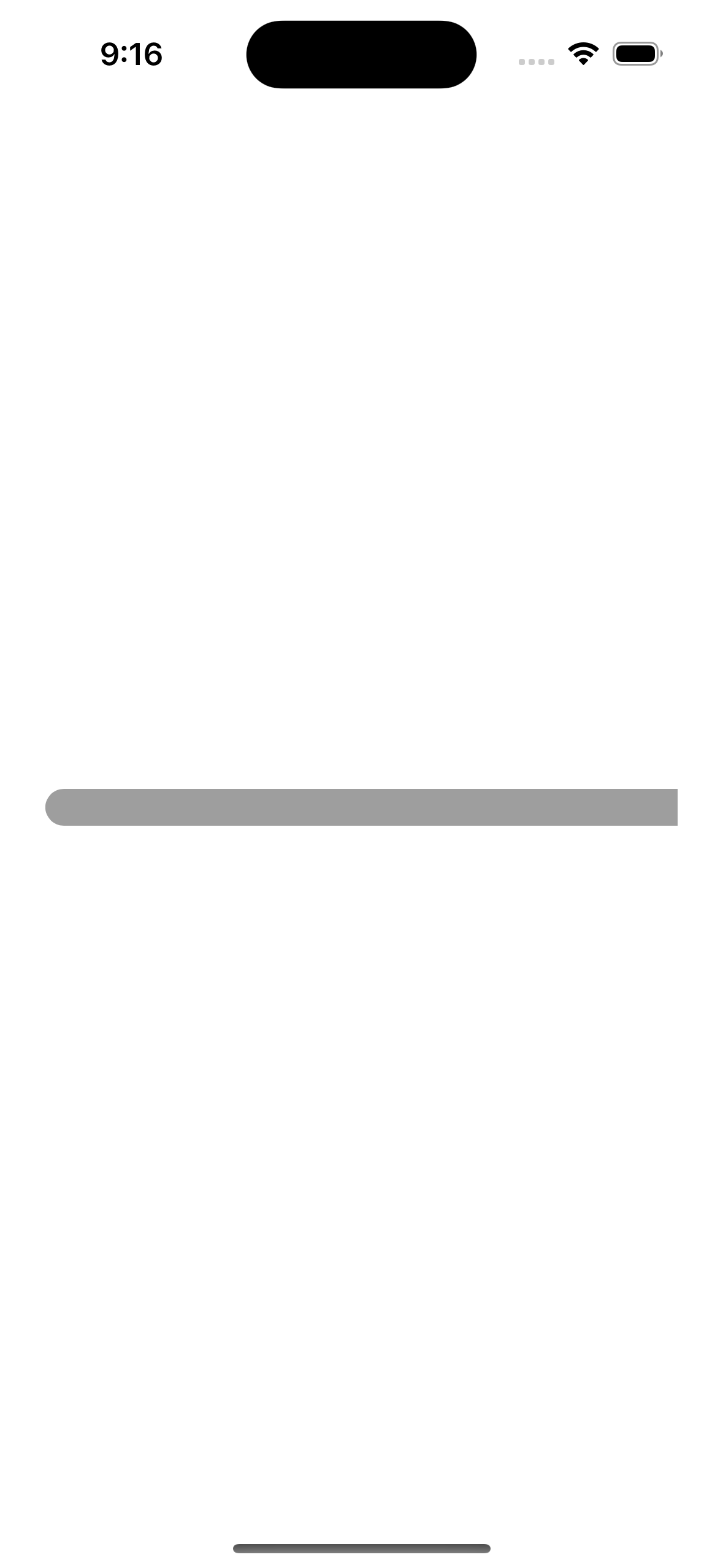
- Segment
Text:
Now we will add the text to the left side of the toggle:
Text
<TouchableOpacity //...>
  <Text
    style={
      selected === 'option 1' ? styles.selectedText : styles.unselectedText
  }>
    Option 1
  </Text>
</TouchableOpacity>
The Text style is determined by the selected variable. Just like above with the TouchableOpacity, the text will appear slightly different depending on if it's side of the segment is selected or not.
Styles:
selectedText: {
  fontWeight: '600',
  color: 'black',
},
unselectedText: {
  color: 'black',
  opacity: 0.7,
},
selectedText: bold, black textunselectedText: still black text but slightly transparent
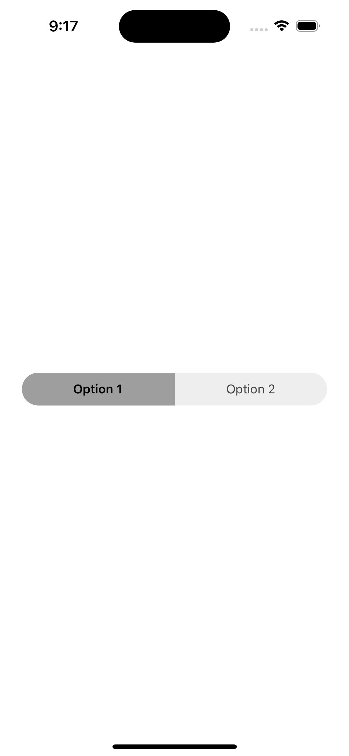
Now the toggle looks like this:
To add the right side, we will just add another TouchableOpacity and Text components and the corresponding styles for the right side:
<TouchableOpacity
  style={[
    styles.segment,
    selected === 'option 2'
      ? styles.selectedSegment
      : styles.unselectedSegment,
    styles.rightSegment,
  ]}
  onPress={() => setSelected('option 2')}>
    <Text
      style={
        selected === 'option 2' ? styles.selectedText : styles.unselectedText
      }>
        Option 2
    </Text>
</TouchableOpacity>
This is the same code as above but with a few tweaks:
option 2replacesoptions 1rightSegmentis used instead ofleftSegment
rightSegment
All we need to add now is a style for the right side segment:
rightSegment: {
  borderTopRightRadius: 40,
  borderBottomRightRadius: 40,
},
- Same as
leftSegmentexcept it rounds out the top right and bottom right corners instead of the left side corners (this creates a "pill" shape)
Complete Component File
Here is the complete component:
import React, { useState } from "react";
import { View, Text, TouchableOpacity, StyleSheet } from "react-native";

const SegmentToggle = () => {
  const [selected, setSelected] = useState<"option 1" | "option 2">("option 1");

  return (
    <View style={styles.container}>
      <TouchableOpacity
        style={[
          styles.segment,
          selected === "option 1"
            ? styles.selectedSegment
            : styles.unselectedSegment,
          styles.leftSegment,
        ]}
        onPress={() => setSelected("option 1")}
      >
        <Text
          style={
            selected === "option 1"
              ? styles.selectedText
              : styles.unselectedText
          }
        >
          Option 1
        </Text>
      </TouchableOpacity>

      <TouchableOpacity
        style={[
          styles.segment,
          selected === "option 2"
            ? styles.selectedSegment
            : styles.unselectedSegment,
          styles.rightSegment,
        ]}
        onPress={() => setSelected("option 2")}
      >
        <Text
          style={
            selected === "option 2"
              ? styles.selectedText
              : styles.unselectedText
          }
        >
          Option 2
        </Text>
      </TouchableOpacity>
    </View>
  );
};

const styles = StyleSheet.create({
  container: {
    flexDirection: "row",
  },
  segment: {
    paddingVertical: 10,
    paddingHorizontal: 25,
    flex: 1,
    alignItems: "center",
  },
  selectedSegment: {
    backgroundColor: "#9E9E9E",
  },
  unselectedSegment: {
    backgroundColor: "#EEEEEE",
  },
  selectedText: {
    fontWeight: "600",
    color: "black",
  },
  unselectedText: {
    color: "#000",
    opacity: 0.7,
  },
  leftSegment: {
    borderTopLeftRadius: 40,
    borderBottomLeftRadius: 40,
  },
  rightSegment: {
    borderTopRightRadius: 40,
    borderBottomRightRadius: 40,
  },
});

export default SegmentToggle;